Friday 27 March 2009

Where to live???


The target audience would live in student accomodation such as halls of residence, student flats/apartments. After looking at the classification maps on www.caci.co.uk/acornmap.asp i believe that the target audience would fit into the following sections:

Catergory:  Urban Prosperity
Group:        Aspiring Singles
Type:          20 - Student flats and cosmopolitan sharers.

Who are they???


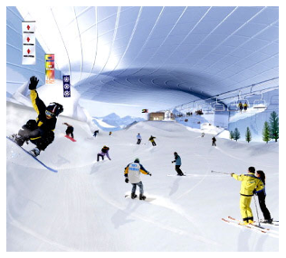
The final artwork/poster from the information brief will be aimed at a target audience of people aged at 18-25 years old. This is the age that students would most likely attend university. These people on the photograph look about the age of my target audience.

Friday 20 March 2009

Signs and symbols book >>


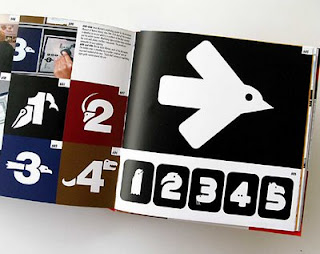
This book has really inspired me when looking at Information Design further within my research.  It is called 'Signs and Symbols, Communicating with pattern'. It uses everday and unusual symbols to create patterns and unusual designs. This helped me when i was discovering a style of information design I found really interesting.

Wednesday 18 March 2009

Colour


These are a range of colour palettes I have been looking at on www.wgsn-edu.com. I have been using them to make an informed decision about which colours I will use for my information design poster to create a contemporary look.

Monday 16 March 2009

100 people a year choke to death on ball point pens???

'100 people a year choke to death on ball point pens', this is the statistic I have chosen to use, which will then be showcased in the format of an A2 poster. The requirements of the brief ask for the poster to be an information design piece of work. On initially reading the brief I felt challenged when asked to produce the A2 poster as a piece of informative design, however I now think it will be interesting to challenge the brief and gather a wide variety of relevant research to expand my knowledge of information design.

Sunday 15 March 2009

Vivienne Westwood Opus Bookcover Designs..

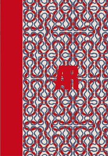
Here are a range of book covers which are currently used for the Vivienne Westwood Opus Book 'Active Resistance Against Propaganda'. I have used them within my blog as I believe they will give me inspiration when designing my poster, as some of them are made up of really contemporary colours and images, particularly the 'I Am Expensive' cover. I really love how the designs totally capture the unique and eye catching style of Vivienne Westwood and her fashion design.


Information Design

This is an image of the 2008 Olympic Pictograms I found on a design related blog, stupid-studio.com. It caught my eye as I am currently collecting information design research for a Conceptual Design brief. They are basic shapes but create a clear message, these images will help to inspire me when I am producing my own piece of Information Design.